
Changing the conversation around women’s wealth.
Women retire with about 28% less superannuation than men. This gap persists despite women’s equal contribution to the workforce and is driven by the innate responsibilities of caregiving, part-time work, and pay inequality. The result is long-term financial insecurity that impacts women across ages, life stages, and income levels.
01 Project Overview
Tap the Gap is a digital financial experience designed to transform the "silent" systemic failure of the gender superannuation gap into a catalyst for emotional empowerment. While women retire with 28% less super due to structural inequities, traditional financial tools often feel distant or intimidating. We developed a next-generation lifestyle calculator that translates abstract data into a relatable "lifestyle gap," paired with reinvented features that turn spare change into financial security like Round Ups. By flipping the "point of purchase" into a point of wealth creation, Tap the Gap turns a 30-year hurdle into an achievable, daily habit.

02 Emotional Empowerment
The Challenge: Retirement planning is often treated as a "future problem." Standard calculators are sterile and data-heavy, failing to bridge the gap between abstract numbers and a user’s desired future.
The Solution: We shifted the focus from "total figures" to "desired lifestyle" for better understanding. Then, by visually comparing a user’s projected standing to that of their male counterparts, we triggered "emotional momentum."
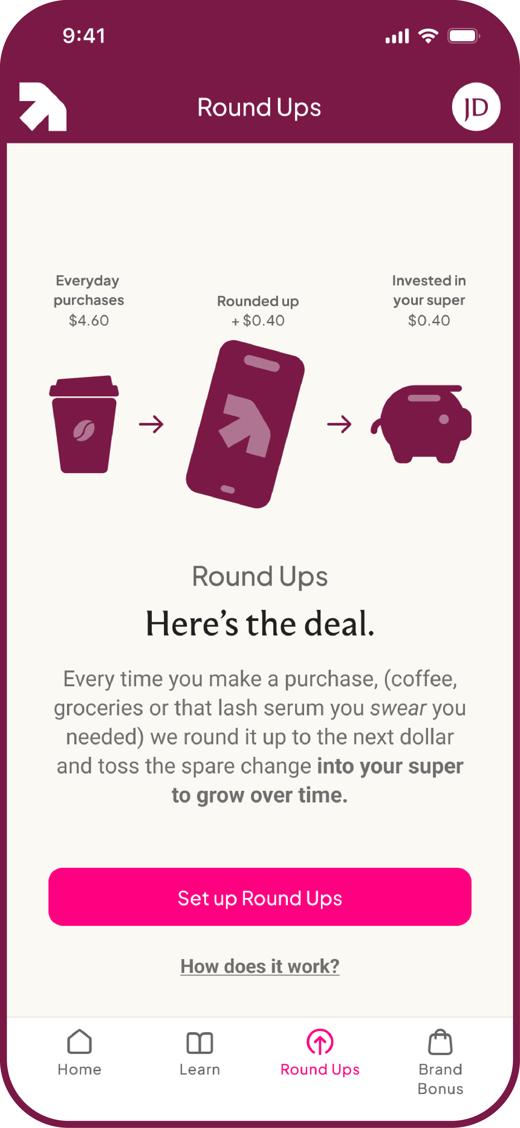
Bridging the gap between realisation and action
This next-generation retirement calculator was designed to be the entry point for behavioural change. By allowing users to easily discover their super gap based on personalised lifestyle goals, we created a clear "moment of realisation." Followed by the visual comparison of men, layering and building the emotional momentum. Making the transition from the results page to the Round-Ups feature an immediate, easy solution to the identified deficit. This design converts a systemic failing into a personal, empowering pathway toward long-term financial security.
03 Building Trust & Transparency
The Problem: Users find 30-year savings goals psychologically daunting and are often sceptical of third-party bank integrations.
The Solution: Scaffolded trust through accessible narrative.
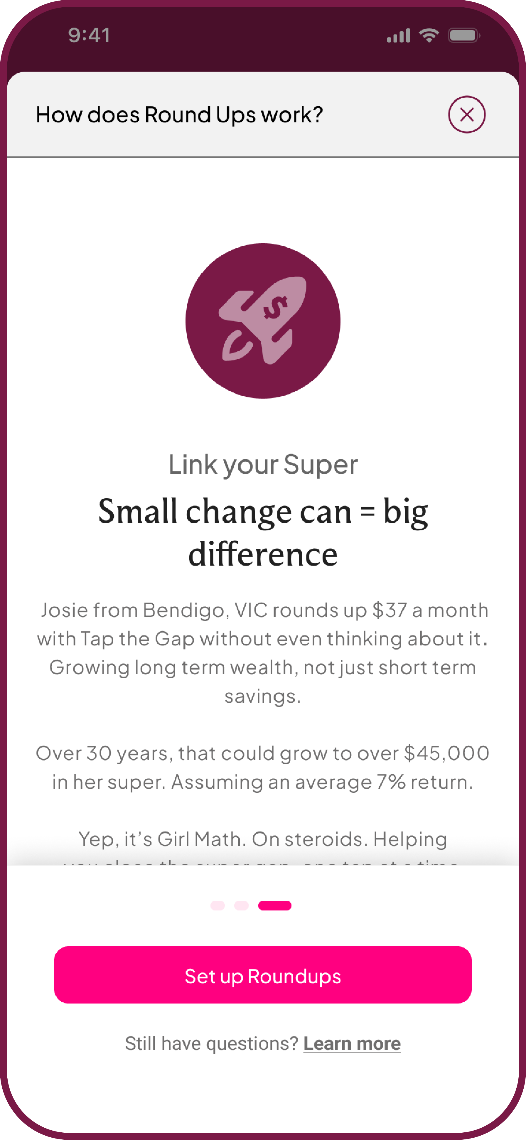
Understanding the impact: We continued our scenario-based narrative to help users see how the feature could help achieve what might feel like an unattainable financial goal and build confidence and motivation to follow through on setting up the feature.
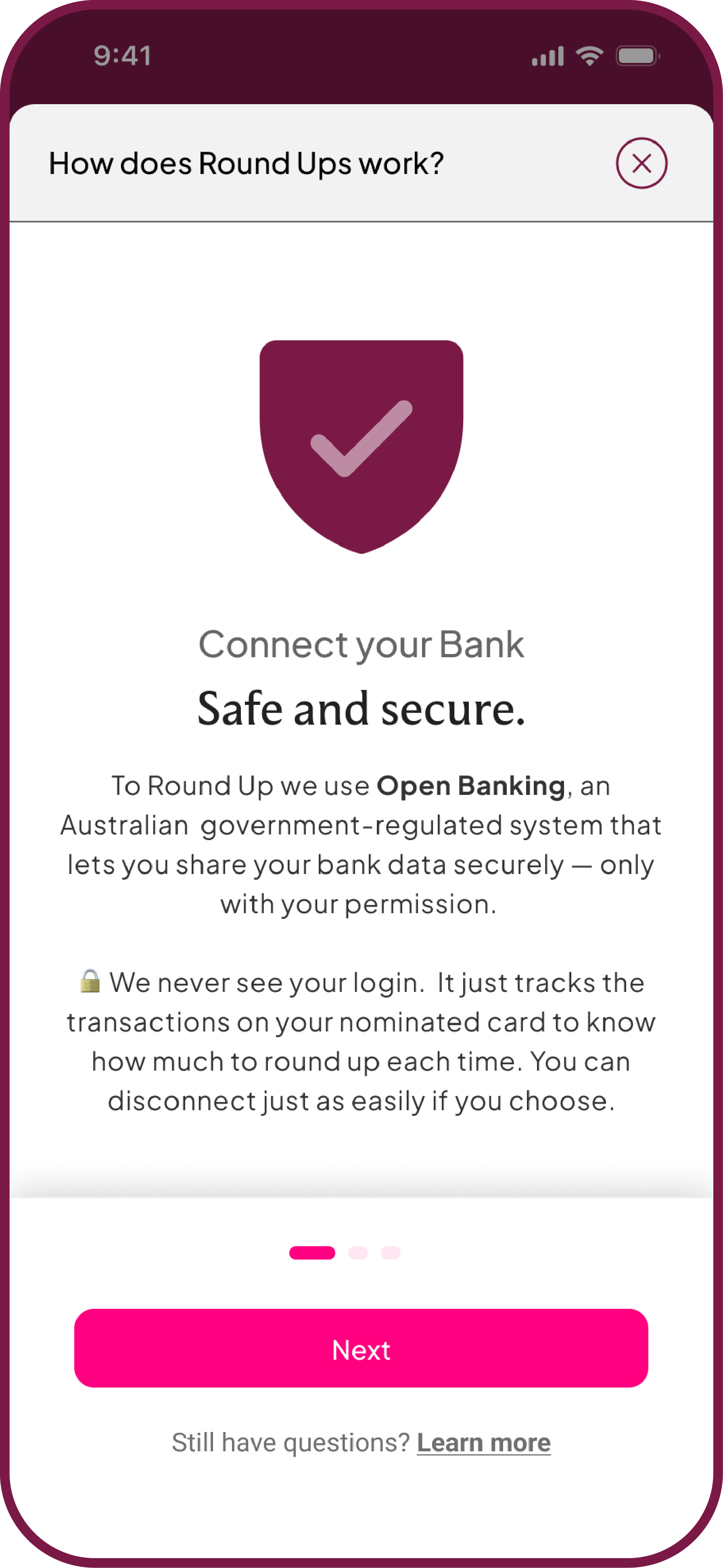
Building Trust: We used transparent, accessible language to explain the how, what and why simply, addressing security anxiety through "snackable" information.
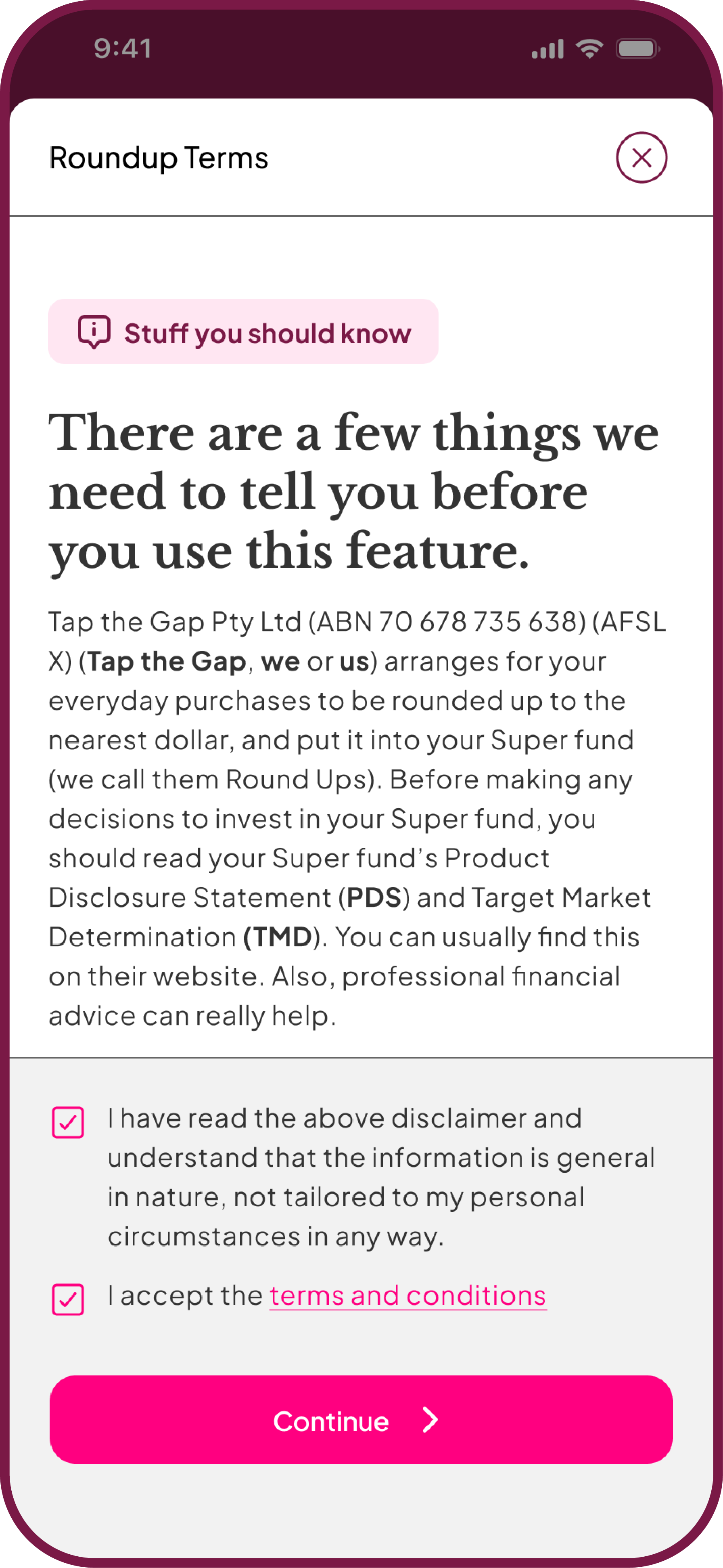
Breaking the 'Scroll-and-Dismiss' cycle: We replaced hidden compliance with intentional transparency. By slowing the user down for "Stuff you should know," we built trust at the precise moment it is typically broken.
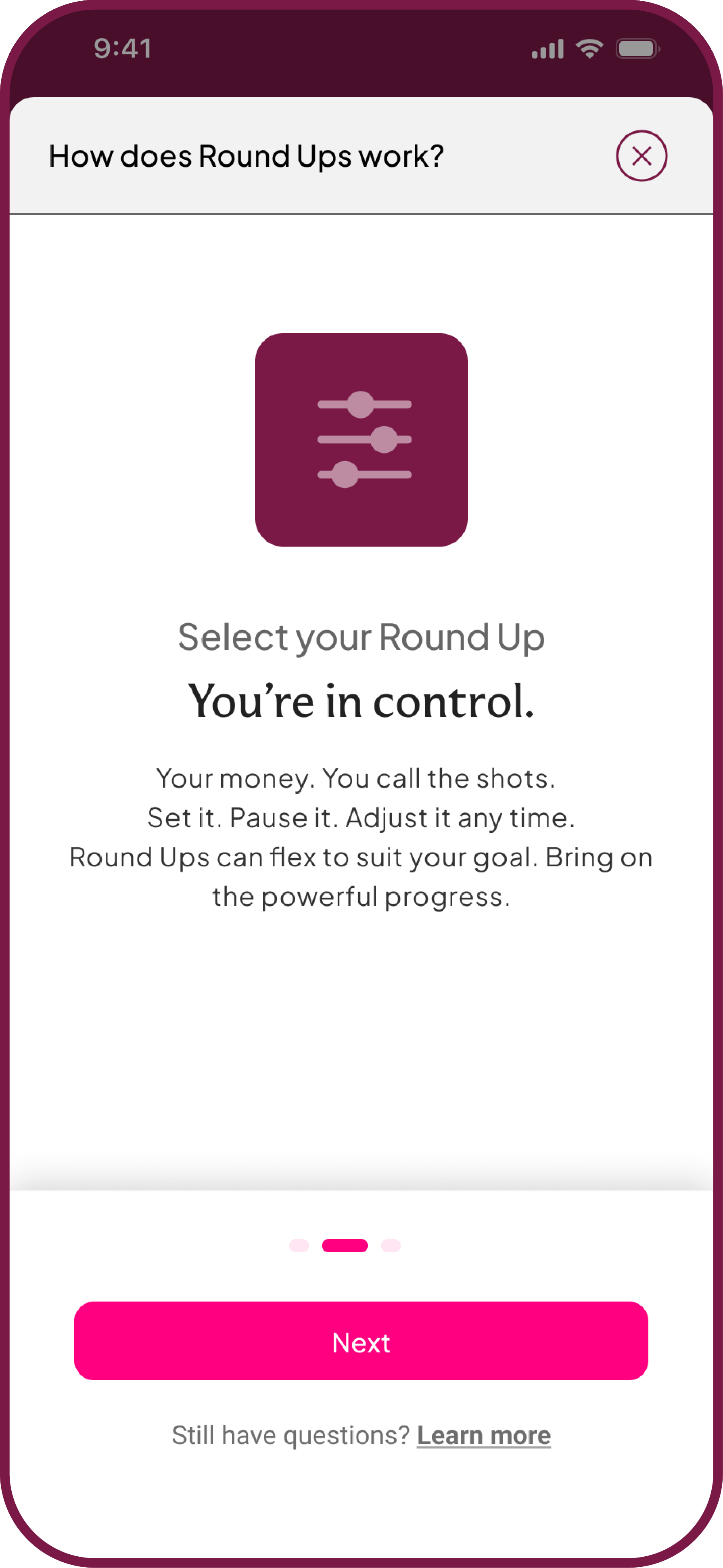
Converting friction into confidence: We replaced intimidating long-form setups with a stage-gated progress tracker. This gave users a sense of control and "safety nets" through automatic progress saving.
Building confidence and trust
We used a storytelling narrative to guide the user through scaffolded levels of information. This sequence utilises transparent, accessible language to explain the complexities of Open Banking, Round Ups and linking your Super simply and quickly, addressing “user nervousness” about the process. By starting with a "snackable" one-pager and closing with a scenario-based example of compound growth, we help users visualise roundups as the immediate solution to their wealth gap.
Breaking the 'Scroll-and-Dismiss' cycle of onboarding
We refused to create a "hidden" compliance step. This screen demonstrates our commitment to transparency by intentionally slowing the user journey, ensuring they digest "Stuff you should know" rather than dismissing it as annoying small print. By presenting clear terms in plain language, we reduce the onboarding friction of third-party products and build trust at the moment it is often lost.
Converting friction into confidence through sequential progress
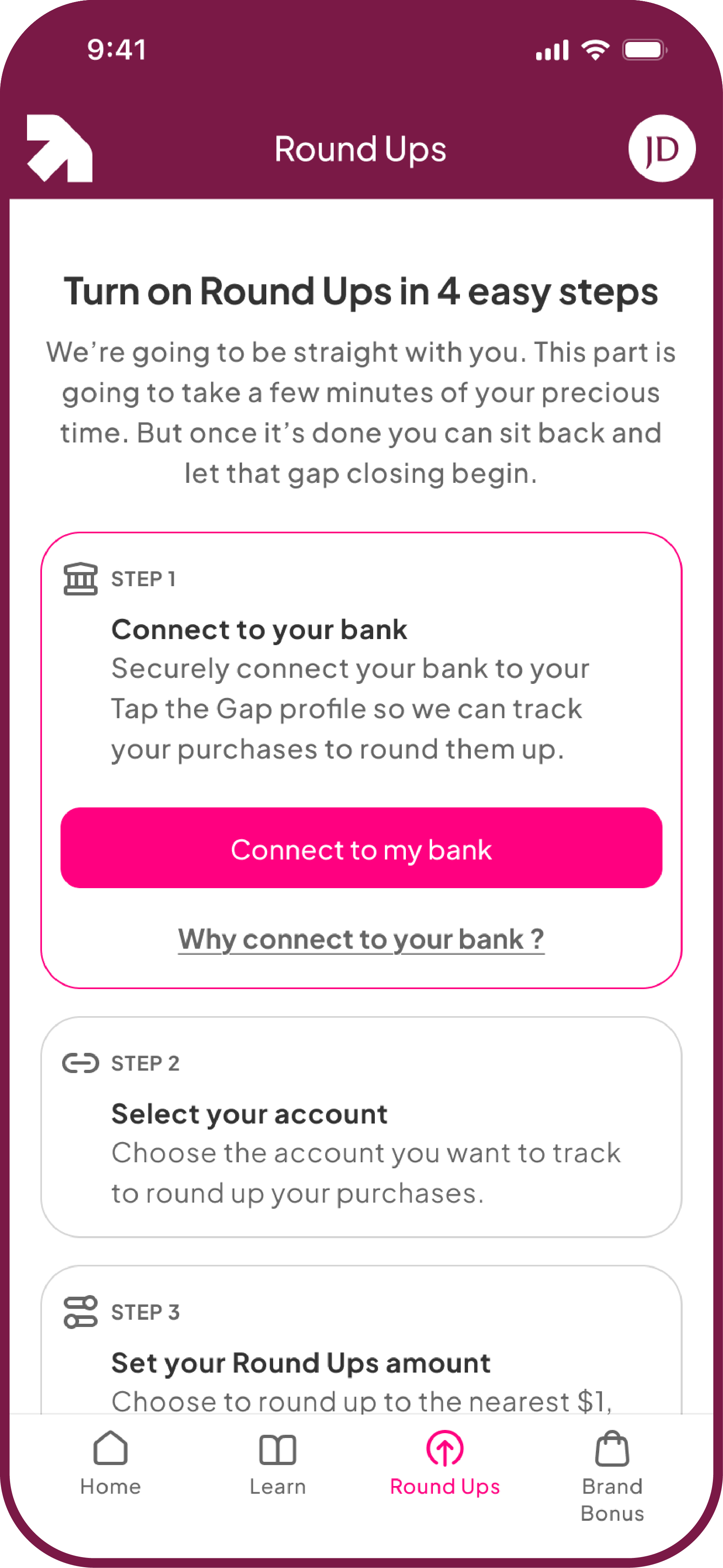
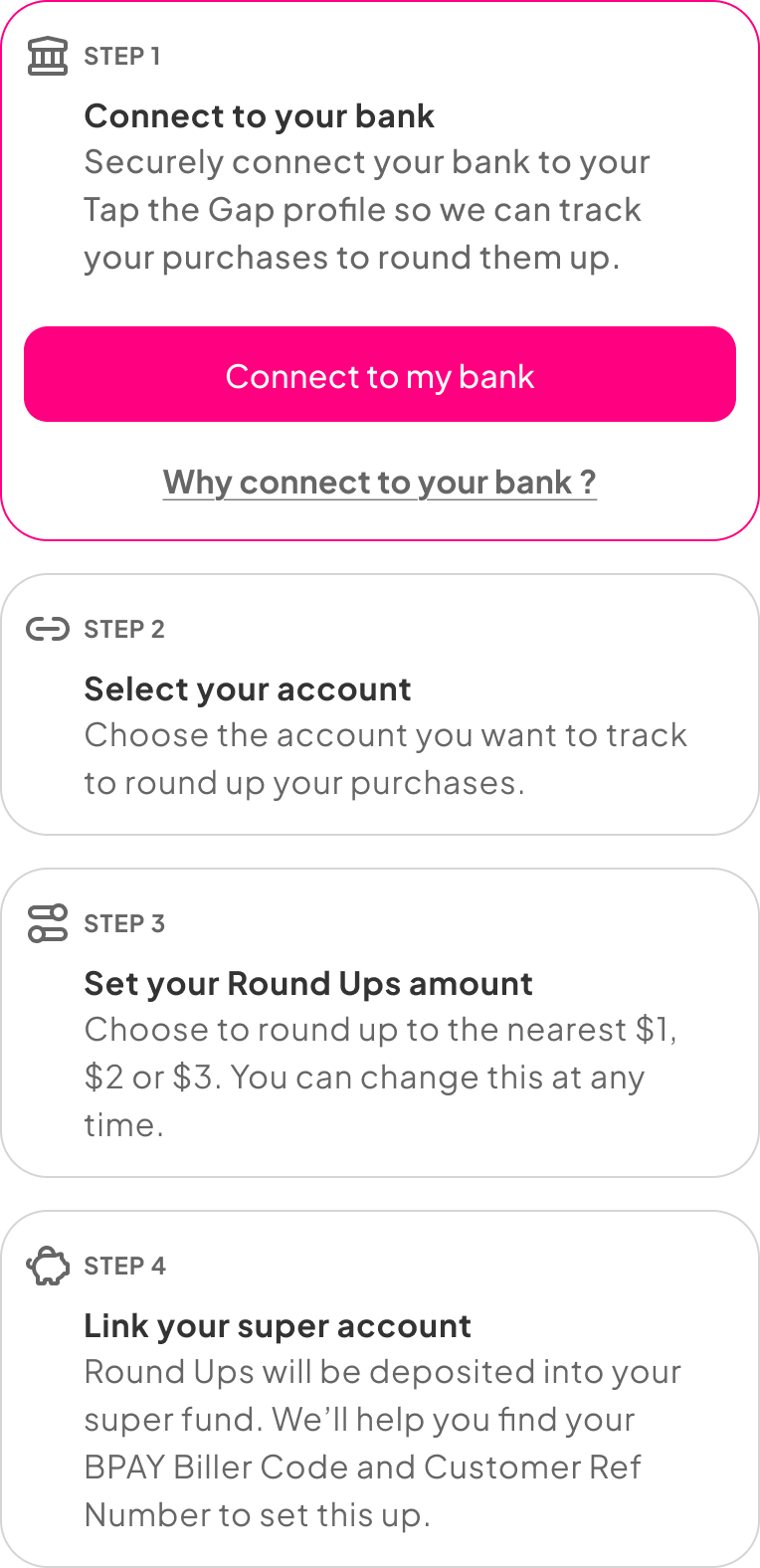
We solved for onboarding abandonment by replacing a long, intimidating process with a stage-gated progress tracker. This design breaks down the connection between the bank, round ups, and superannuation into four distinct, digestible actions. By providing deep-dive "Why?" links at each step and reinforcing the benefit of "closing the gap," we transitioned the user from a state of scepticism to one of validated action. The result is a setup process that feels supported, secure, and entirely under the user's control.
04 The Result: Sustaining Momentum
The final experience replaces technical setup with motivational validation. By pairing a dynamic future-value forecaster with community-driven goals, we addressed the "disconnect" people feel with superannuation. The result is a dashboard that fosters a sense of belonging to a "tribe", helping users close the gap together and move from scepticism to long-term financial independence.
05 Lessons learned
Design for emotional proximity
Financial data is cold, but aspirational lifestyles are emotional. By placing the "point of realisation" (the super gap) directly alongside the "point of action" (enabling Round Ups), we captured the user’s peak motivation—transforming a daunting realisation into immediate momentum.
Transparency as a conversion tool
In fintech, "too fast" can feel "too risky." By being loud and clear about Open Banking and data privacy, we transformed a potential friction point into a trust-building exercise. This transparency led users to feel significantly more confident when linking personal financial accounts.
The power of ‘Miro-Wins”
Retirement is a 30-year marathon that is psychologically exhausting to contemplate. Shifting the UI focus to "Community Averages" and $30/week goals replaced long-term anxiety with short-term "micro-progress," using social proof and visual validation to manage user stamina.
Designing for systemic change
This project reinforced that design is a powerful tool for advocacy. By visually contrasting a woman’s projected retirement against a man’s, we didn't just show a number, we highlighted a systemic inequity. This sparked a shift in users to move beyond awareness and toward active financial education and security.